Vitamins with style
Client: Ping!
Project: Packaging System
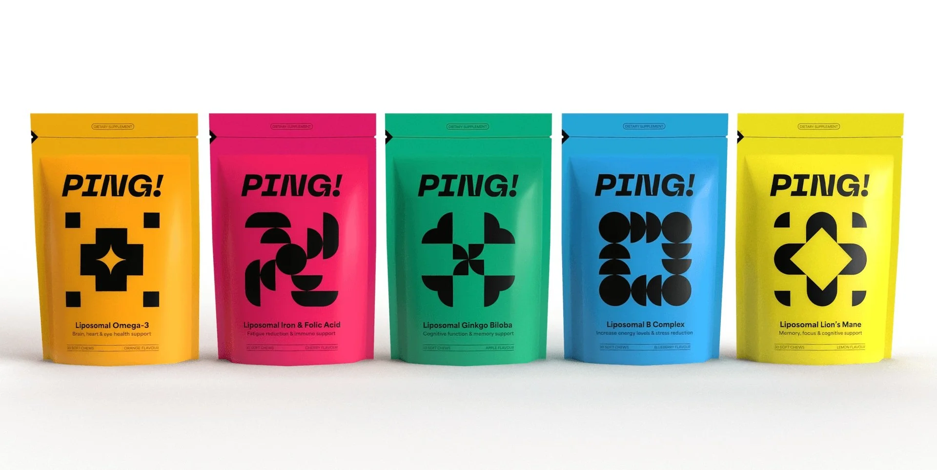
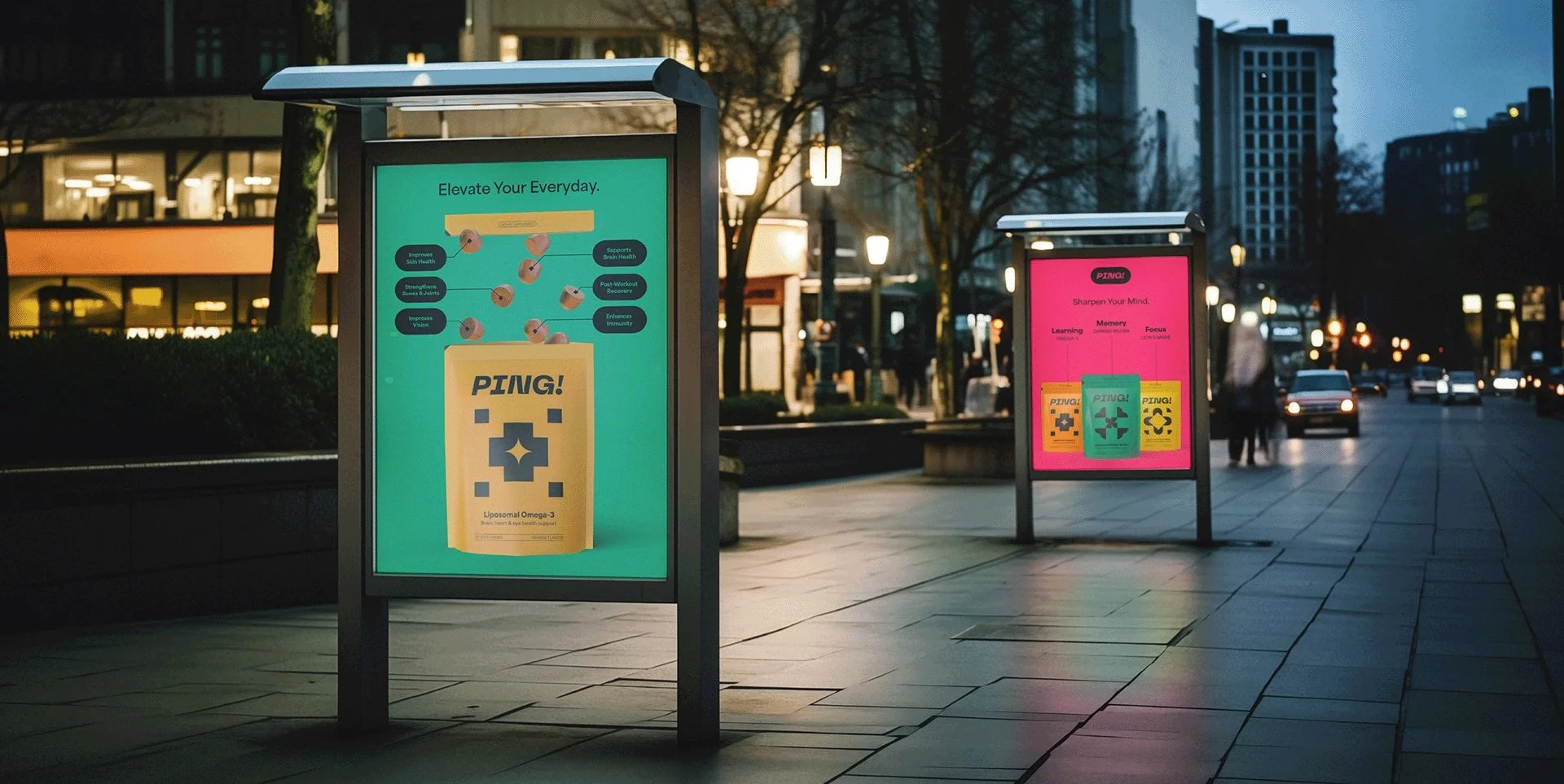
Ping! is a liposomal vitamin brand for ambitious individuals striving for peak performance in their careers, relationships, and overall well-being. To help Ping! find its audience; I developed a minimalist, scalable packaging system with clarity and shelf appeal.
As a sister company to an existing vitamin brand, Ping! sought to expand its reach beyond the traditional family market. Recognising the potential within the younger, aspirational demographic, I was tasked with developing a distinct brand identity for their innovative liposomal vitamins. The challenge was to create a visually compelling and shelf-worthy presence that differentiated Ping! from the competition in the crowded vitamin landscape. Furthermore, the design system had to be flexible and scalable to accommodate future product introductions.
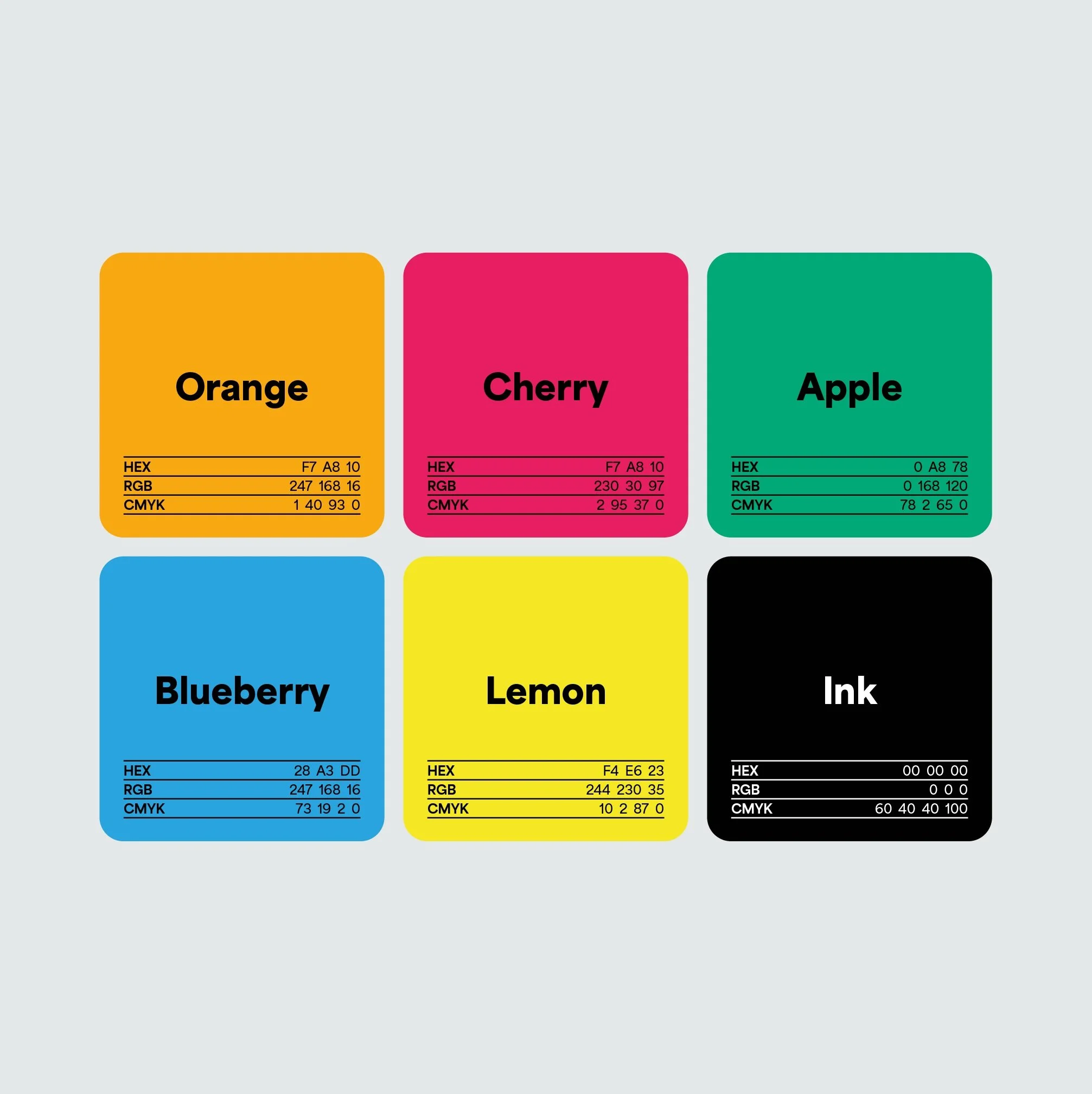
Through in-depth market research, I worked closely with the company owner to explore a range of visual approaches. We landed on a clean, minimalist aesthetic with a vibrant colour palette and contemporary typography.
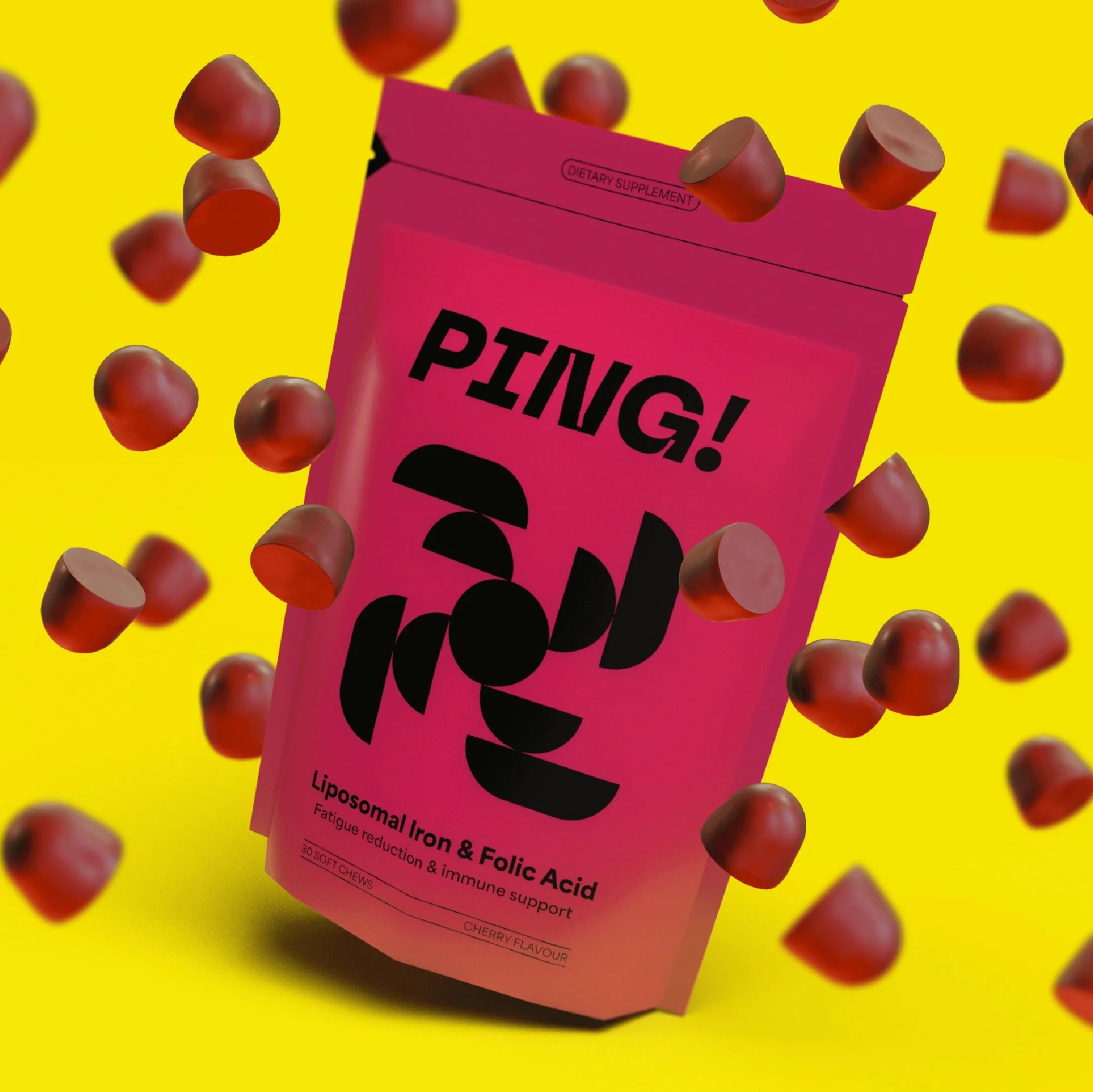
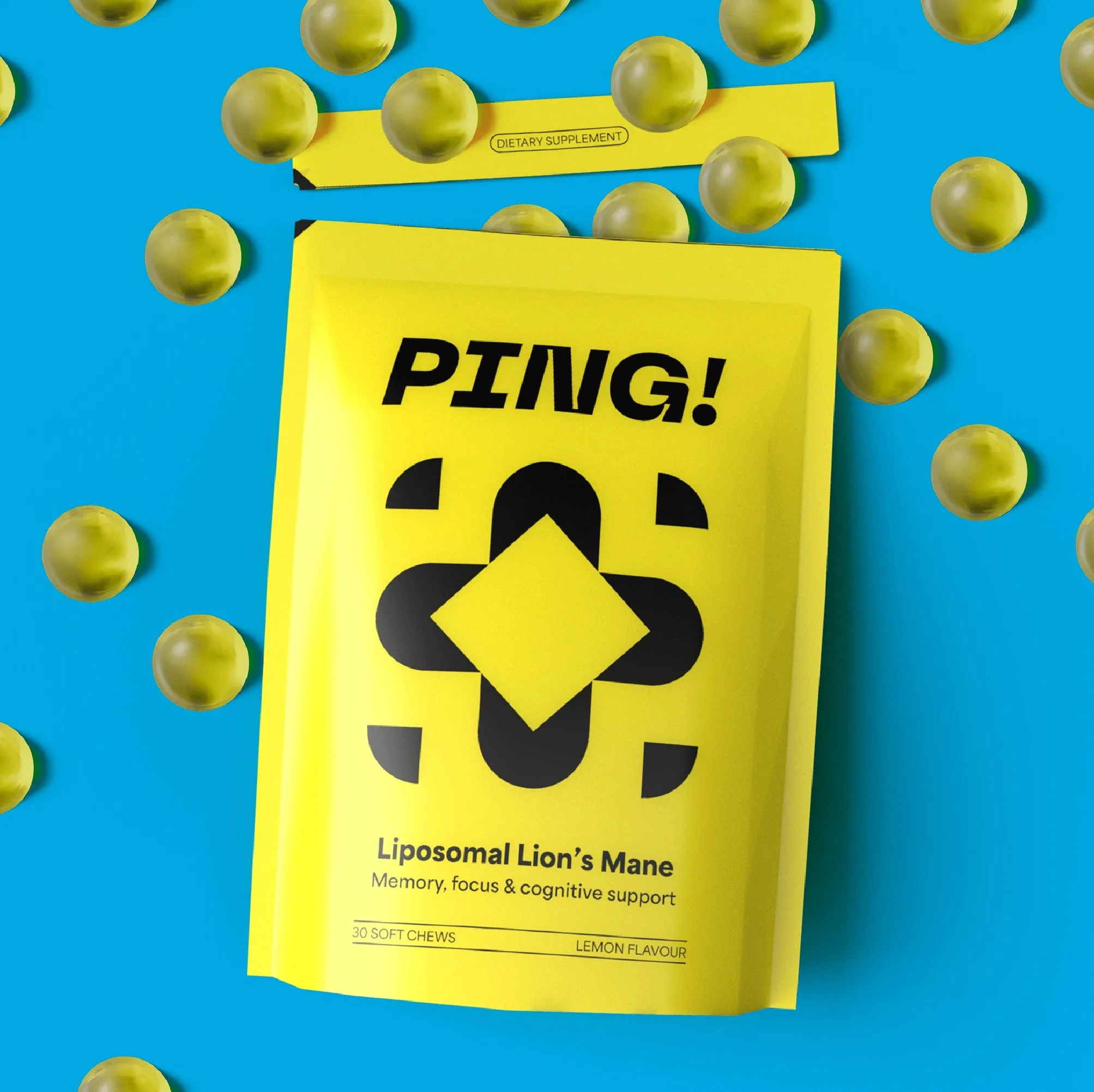
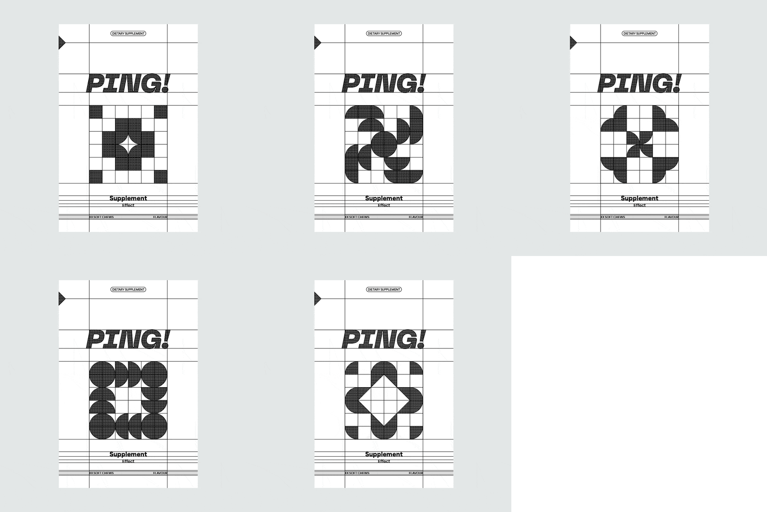
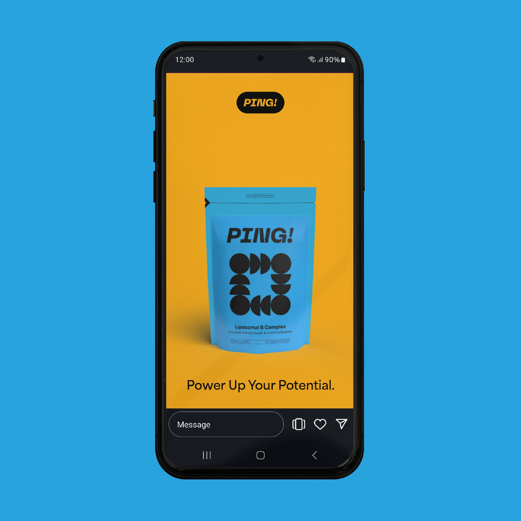
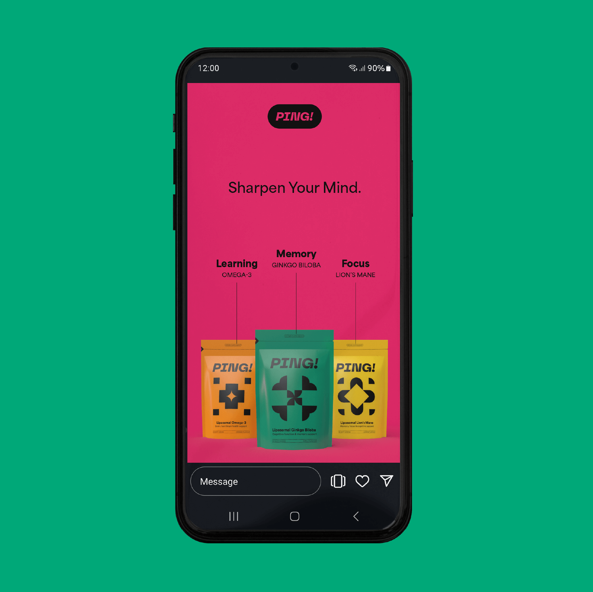
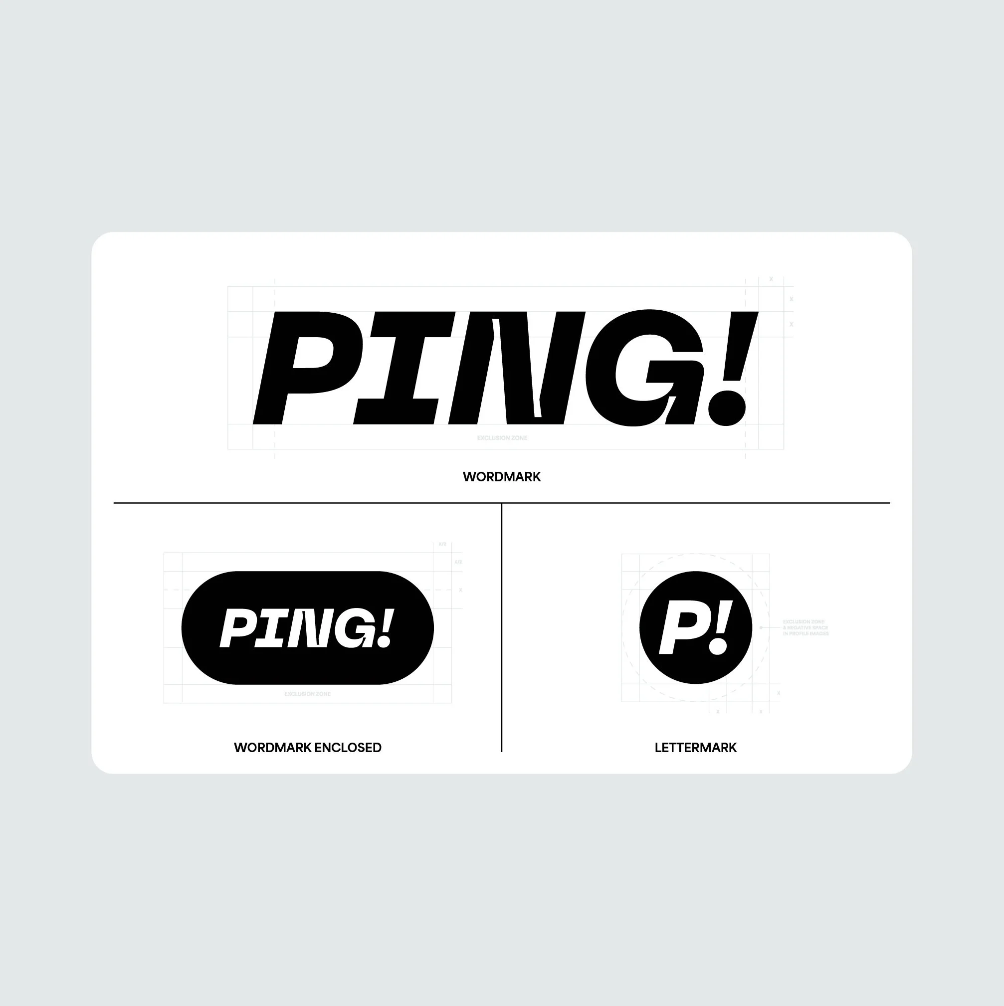
This packaging system employs a distinctive iconography, with each product uniquely symbolised by a custom geometric design within a 6x6 grid. These icons visually communicate the benefits of each vitamin. The modular design system facilitates the seamless introduction of new products. In addition to the packaging, I developed key brand assets, including custom icons, social media templates, and 3D renderings of the packaging and vitamins to support the product launch.


